Thursday, April 16, 2015
Wednesday, April 15, 2015
Intro Music!
The track that will be playing in the beginning of the documentary will be "City Night" a piece composed by Shelbie herself! Of course, I would credit her at the end of the film, but because the project only calls for an excerpt, the audience will not see the credits. She is, however, on the poster under "Music By."


Sunday, April 12, 2015
Done filming!
All filming was finished today! I made sure to take a lot of extra shots and pans over Shelbie's various instruments. The midshot I used for the interview portion was nicely composed, featuring her guitars and a pleasing color scheme. My camera was unable to record focus pulls, a problem I hope to be able to fix when editing.
Thursday, April 9, 2015
Cover
I want a very bold cover, one that captures the deep feeling of passion I am trying to convey. Again, I will reference the documentary First Position. This cover is incredible.

Looking at the 25 best music documentaries streaming on Netflix, many of the covers are very interesting, and definitely draw me in. The number one best documentary is Muscle Shoals, a documentary about the town of Muscle Shoals in Alabama and how it changed the face of rock and roll. I like the more graphic style it has, one that may be easier for me to capture.

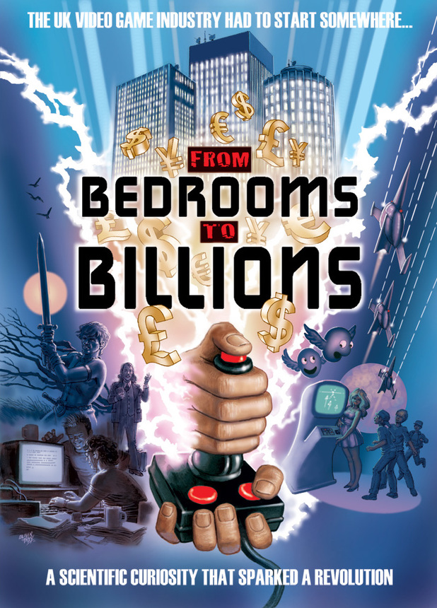
Another documentary, From Bedrooms to Billions, a documentary about the video game industry in the UK has an even more graphic cover. It's basically pop-art, which captures the cartoon style of video games.
Looking at the 25 best music documentaries streaming on Netflix, many of the covers are very interesting, and definitely draw me in. The number one best documentary is Muscle Shoals, a documentary about the town of Muscle Shoals in Alabama and how it changed the face of rock and roll. I like the more graphic style it has, one that may be easier for me to capture.
Another documentary, From Bedrooms to Billions, a documentary about the video game industry in the UK has an even more graphic cover. It's basically pop-art, which captures the cartoon style of video games.
Website, Marketing Approach, Inspiration
I have started creating the website for my documentary. I am keeping in mind the Music Video Project and how in-depth our study of audience/institutions and target audience was. The artistic, more graphic tone of my magazine will carry throughout this documentary, poster, and website, as well. My target audience is artistically-inclined young adults, so I find that a less-typical design should go along with it. A case study I will be referring to is the documentary First Position. This documentary follows dancers through the Young American Grand Prix, a competition where scouts from world-renowned ballet companies come looking for fresh talent. This documentary is not only beautifully shot, but it captures the pure passion for dance that these kids feel. It was distributed in the US by IFC Films (Sundance Selects), a company known for distributing documentaries and independent films. Because this documentary follows six different dancers from different backgrounds, it was distributed in many different countries, reaching a large audience.
This tongue-and-cheek article lists some essentials for making a successful documentary. Moore says that the topic should be interesting but not preach-y, personal but not too boring. Although his writing is caustic, he does acknowledge the importance of trusting yourself and being passionate about your work. He also stresses the importance of sound over picture. "Let's say you didn't shoot something entirely in focus, you had to shoot
it really quickly. The audience doesn't care -- IF the story is strong,
AND they can hear it." I was unaware of how crucial sound is, and I'm glad he brought it to my attention.
"While you are filming a scene for your documentary, are you getting mad at what you are seeing? Are
you crying? Are you cracking up so much that you are afraid that the
microphone is going to pick it up? If that is happening while you are
filming it, then there is a very good chance that's how the audience is
going to respond, too. Trust that."
Moore speaks very candidly and passionately from experience, he emphasizes the importance of staying true to the rawness of documentaries and the true emotion that a target audience is looking for. I very much appreciate his advice.
Friday, April 3, 2015


Friday, March 27, 2015
Cover cont.
I've had a few people tell me that the cover line "Shelbie Rassler" (who is my featured artist for music) is misleading because the cover design is a dancer. I think I will substitute the cover line for a dance story so reader don't get the impression that Shelbie is a dancer.
Also, after looking at the cover with fresh eyes, I realized the left side is much heavier than the right due to the "P" in Passion, the dancer's tutu, and the gradient of the hexagons. I'm deciding whether to drop the opacity of all of the lower hexagons or decrease actual amount of hexagons.
Also, after looking at the cover with fresh eyes, I realized the left side is much heavier than the right due to the "P" in Passion, the dancer's tutu, and the gradient of the hexagons. I'm deciding whether to drop the opacity of all of the lower hexagons or decrease actual amount of hexagons.
Wednesday, March 25, 2015
Cover
After hours of working on Illustrator, I finally finished the cover design!


I'm very pleased with the turnout! It continues the hexagonal and minimalistic theme I started with the table of contents. I also decided to include only one cover line, again to keep the simplicity of the layout and to show the significance of the "featured upcoming artist" section. (A section that will be included in every issue)
The photo is of a piece I did about a year ago, copied below. It is one of the works I am most proud of, and I felt it captured my personal passion for art and dance.
Graphite and flower petals.
Thursday, March 19, 2015
Table of Contents and 2-Page Spread cont.
Table of Contents Stories
Page Number | Story Titles
5 Shelbie Rassler
9 Play it Again
13 Twirl For Me
19 What's the Pointe?
21 -cooking-
28 -cooking-
32 Origins of Watercolor
37 Which Brush is Best?
2-Page Spread
Questions for Shelbie:
How many instruments do you play?
When did you start playing?
What was your first instrument? The order you learned them? Your main instrument?
How is music important to you and how is it involved in your life? (Drum major, competitions you've done)
How did your parents support you? (Family back story and how you came from a performing family)
How do you feel when you play/compose? (Talk about "passion")
What are your plans for the future? (Scoring and such)
Tuesday, March 17, 2015
Table of Contents update
I changed the initial design to this one:

Clearly, it's still missing a few pictures.. But I like the layout much more. It's much more graphic and geometric designs are "in" right now.
Clearly, it's still missing a few pictures.. But I like the layout much more. It's much more graphic and geometric designs are "in" right now.
Friday, March 13, 2015
Table of Contents Cont. and 2-Page Spread
Originally, my two-page-spread was going to feature an in-depth explanation of the magazine itself-as a sort of "what to expect from this new magazine." I was advised against this, however, and I found myself at a loss as to what to report on instead. Because the magazine includes four "categories," I have a lot of freedom. I have a friend, Shelbie, who taught herself to play 14 instruments; I think a story on her and her talent would be interesting and could act as a constant "new featured person" article.
I do still want to include an explanation of the magazine, and I decided to add a page to the table of contents for this purpose. I also finished a tentative table of contents design on Illustrator which I will try to post later (technology is failing me at the moment).
I do still want to include an explanation of the magazine, and I decided to add a page to the table of contents for this purpose. I also finished a tentative table of contents design on Illustrator which I will try to post later (technology is failing me at the moment).
Color schemes
A good color scheme is crucial. It must unify the medium (in this case the magazine) and lead a reader's eye around the page without being overwhelming. After putting together/researching several color schemes, I decided on the number 1. It is enticing, lighthearted, and yet professional. Deep, warm colors like #57102C and #A92159 are passionate while #4CA8A1 (I decided to leave #7EC2AA out) and #BCC747 add contrast and interest.
I have not yet decided what color to assign to each topic (art, music, dance and food).
1)
2)


3)


4)


5)
6)

7)

Thursday, March 5, 2015
Table of Contents Layout Possibilities
Because this magazine had four sections, Food, Art, Music, and Dance, the table of contents also had to be divided into these sections. I tested out several layout possibilities, and I think I've settled on one. (Second picture, left)
It's accessible, organized, but not too busy. Each genre would be separated by color scheme. (I haven't quite decided on which four colors yet.)


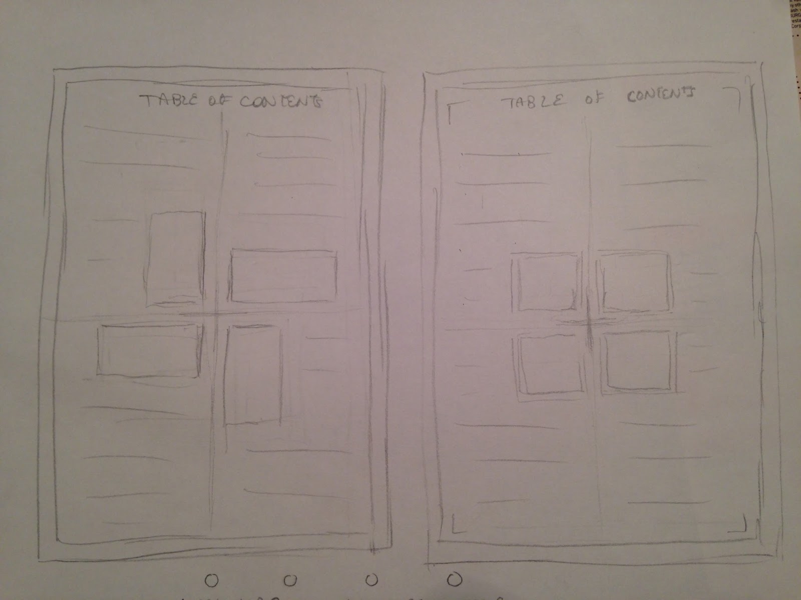
It's accessible, organized, but not too busy. Each genre would be separated by color scheme. (I haven't quite decided on which four colors yet.)
Cover Possibilities
Food/Cooking magazine covers often feature a high definition picture of a gourmet dish with many flashy cover lines and bold fonts.


Arts magazine covers often feature colorful, intricate,and sometimes abstract works of art with less cover lines. They often focus on the cover image's design aspect as opposed to a photograph.
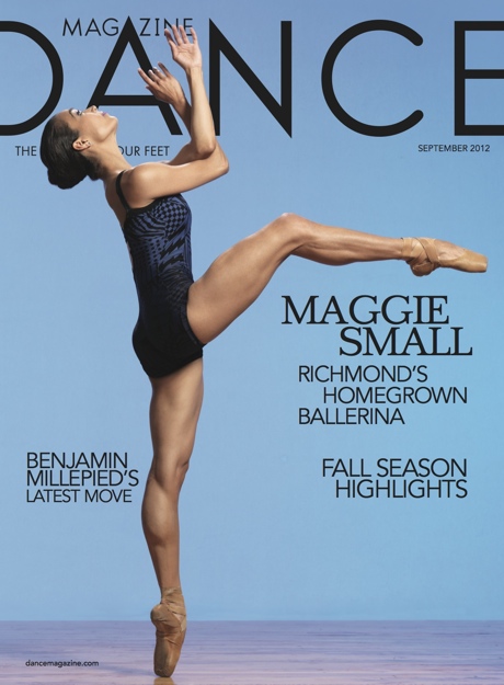
Dance magazine covers often feature a powerful photograph of a dancer, the cover lines placed around the dancer's form.
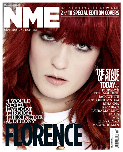
Music magazines often feature a mid-shot or close-up of an musician/artist with many cover lines and bright, eye-catching colors.
Because Passion (working title) features all of these genres, I wanted to incorporate all of these styles without having a cover that was too busy and overwhelming. To truly capture the feeling of passion and convey it to an audience, I felt I should let the audience in on my passion for painting. I decided to paint the cover image and add the cover lines and the masthead later on on Photoshop. This allowed me to have complete artistic freedom and allowed the audience to have insight into the deep, authentic feelings of passion.
Wednesday, March 4, 2015
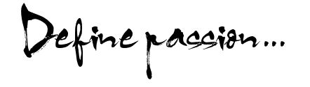
Font shopping
When initially approaching the AS project, my first concern was the aesthetic of the cover. The graphic designer in me was anxious to begin font shopping and testing layout styles for the table of contents and two-page spread. dafont.com is always my go-to website for typefaces, as it has thousands of options in different styles and families. After about an hour of browsing, I came across the font HL Thuphap 1BK. I felt it embodied the artistic/stylistic yet professional look I was going for.
Here's what it looks like:

Here's what it looks like:
Subscribe to:
Posts (Atom)